Helping College Mentors Perfect Their Journey
by redesigning an all-encompassing platform with comprehensive task management tools and other services.
Project Overview
In 2022, Transizion faced a pivotal challenge: their platform, CollegeRize, was struggling to keep up with the demands of their expanding company and planned B2B expansion.
As a key team member, I led an ambitious project to overhaul CollegeRize and revolutionize the mentorship
journey for college mentors, with the goal of empowering and elevating the mentorship experience for students and parents.Our mission was to create a game-changing platform that would meet the needs of our users and exceed their expectations.
Goals
User Goals:
Design an intuitive and efficient way for Mentors to,
Register and get onboarded
Track hours
View student profiles
Plan and organize students' journeys
Track students' progress
Recommend additional services
Business Goals:
Create a platform that is,
Stress-free
Organized
Efficient
Impact
We improved Transizion college mentors workflow by -
Having a central place with all the tools they need to help their students complete their college prep journey
Having the administrative functions and mentorship specific functions separated and categorized by importance
Which helped Transizion, the stakeholder, be more efficient in tracking and facilitating business needs and goals.
Redesigned Platform
Prototype Annotation
How did we get there?
Current Platform
Platform Analysis
CollegeRize Mentors had a complicated and confusing user experience when trying to complete their tasks due to unclear menu options and multiple pathways leading to the same destination, which caused cognitive overload and added to confusion.
We discovered that essential tools required to accomplish their mentorship duties were not integrated into the CollegeRize platform, necessitating the use of external tools.
The Problem
Our analysis of the CollegeRize platform found that mentors face a cumbersome and error-prone workflow, as they are required to frequently switch between various tools and platforms to complete tasks. Moreover, they are saddled with repetitive administrative work, further increasing their workload.
What did we discover?
Research
With the limited amount of time and resources, we decided to conduct interviews with four mentors to validate our initial findings and dig deeper into what pain points, needs and additional requests they may have.
User Interviews
Dovetail Data Synthesis
Codebook
Affinity Map
To streamline our analysis process, we developed a comprehensive codebook to efficiently tag and categorize the interview data using Dovetail. Once the data was tagged, we exported it into an affinity map, providing us with a visual representation of the data and enabling us to identify patterns and trends more easily.
Discovery
Requests:
Customizable timelines
Professional development opportunities
Pain Points:
Disparate and complex workflows
No simulataneous viewing of students Communication
User Persona
Based on our findings, we created a user persona to better understand the needs and behaviors of our target users.
User Persona
Design Solutions
The data collected from the interviews not only validated our initial findings but also provided additional insights that can help us improve our design.
To alleviate mentors pain points and adhere to their requests, we decided to:
Divide and group features into main menus and supporting sub menus
Add a Dashboard
- With snap shots of frequently used menus
- Overview of important info
- Helpful Links to frequently used menus
Group Mentee specific features under Mentee Main Menu
- Snap shots of mentees’ progress- Overview of To-Do’s and Timesheet
- Mentee List
Add a Switch Pod function on top of each page
- Easy access to different Mentee Pods
Initial Wireframes
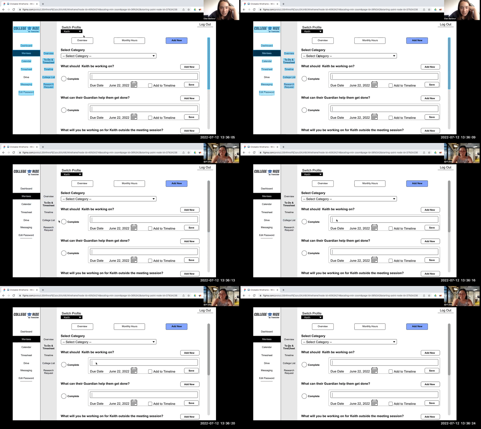
Usability Testing
Amid testing the usability, we realized our design had crucial flaws and needed to be iterated. We quickly went to work and designed a mid-fi wireframes with the data we collected from the initial usability testing.
Usability Testing
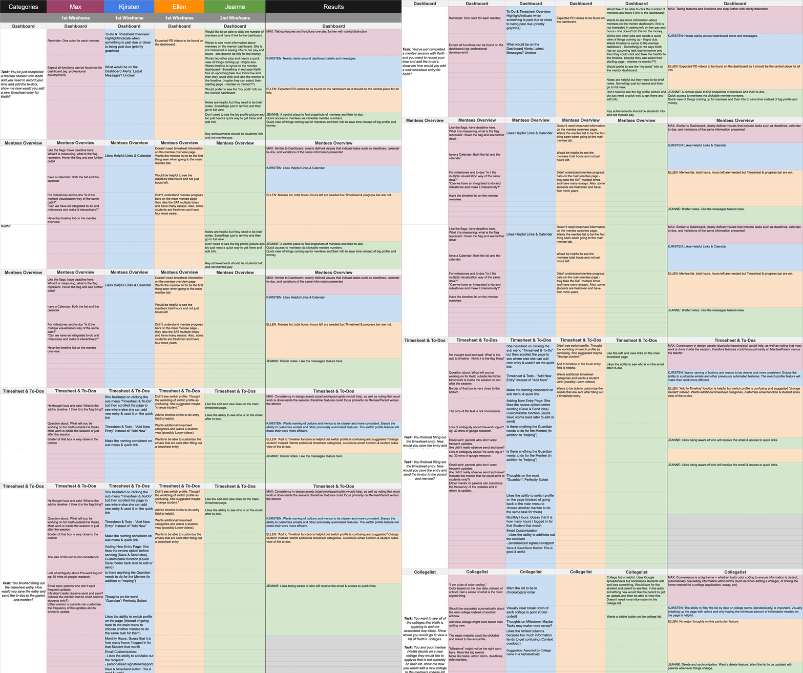
Usability Testing Synthesis
Design Iterations
We revamped the site's design approach by dividing the main menus into "Administrative Functions" and "Mentee Specific Functions," eliminating sub-menus to reduce confusion and cognitive overload. By grouping the main menus under two categories, we were able to streamline the user experience. Additionally, we restructured the Mentor Dashboard to showcase only the most vital information to the users.
Mentor Menus
Mentee Menus
New Sitemap
The findings resulted in further iterations.
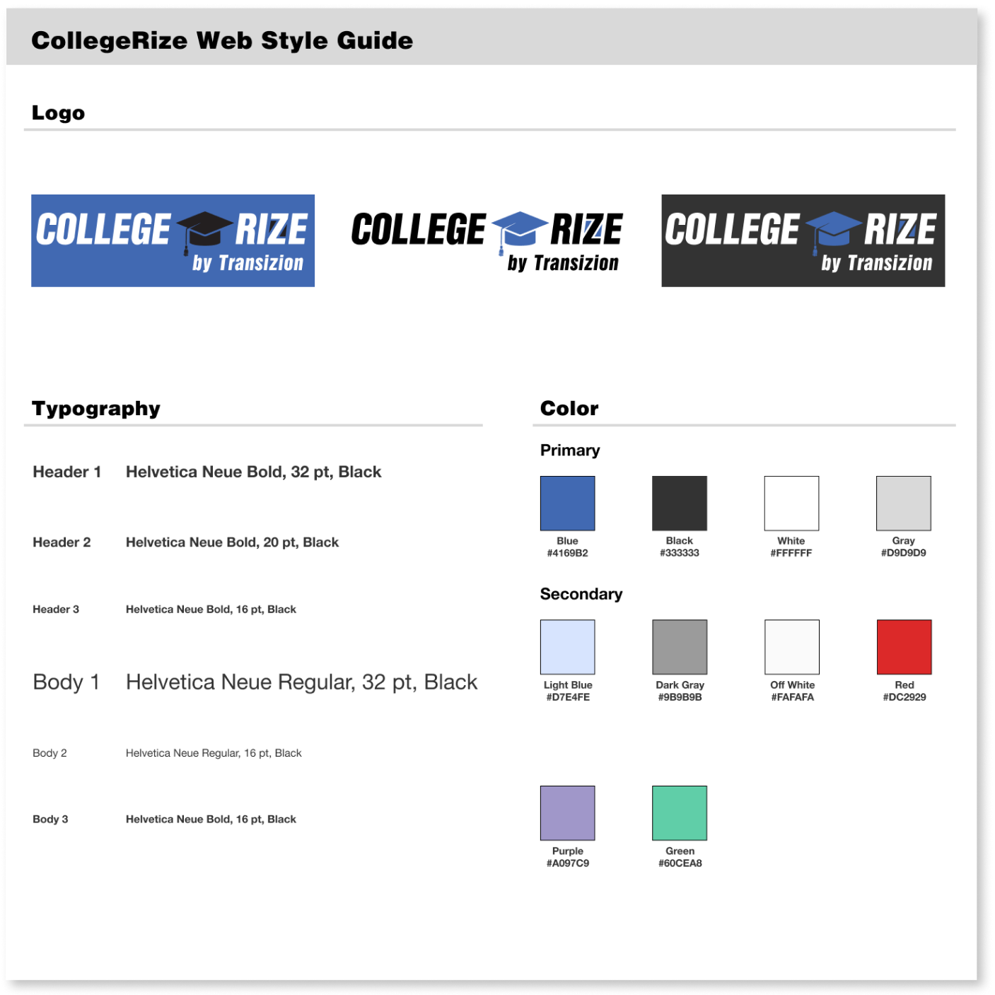
Although the iterated design improved usability, more areas needed fixing and additional features were necessary. We conducted another round of iteration and incorporated the style guide I created to finalize the hi-fi prototype.
Design System and Branding
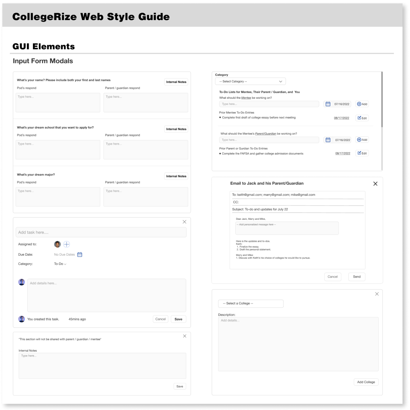
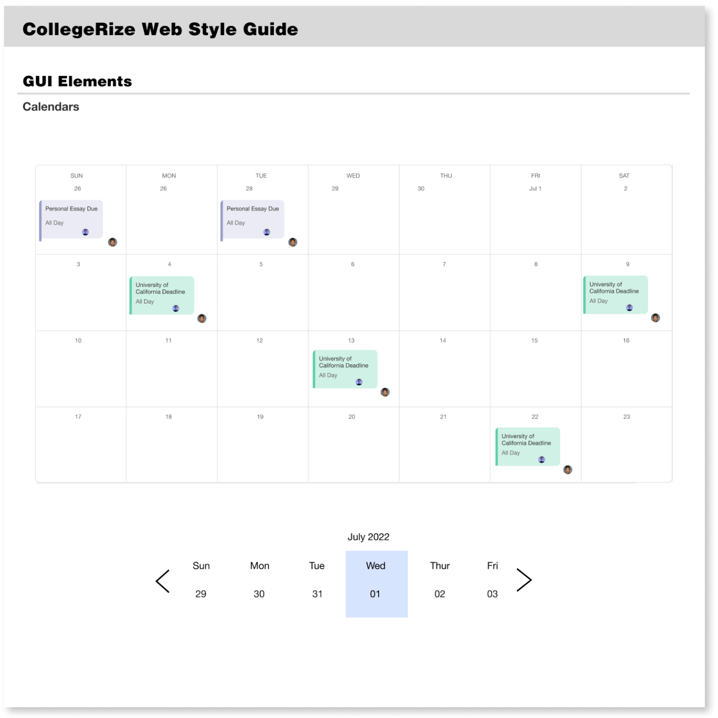
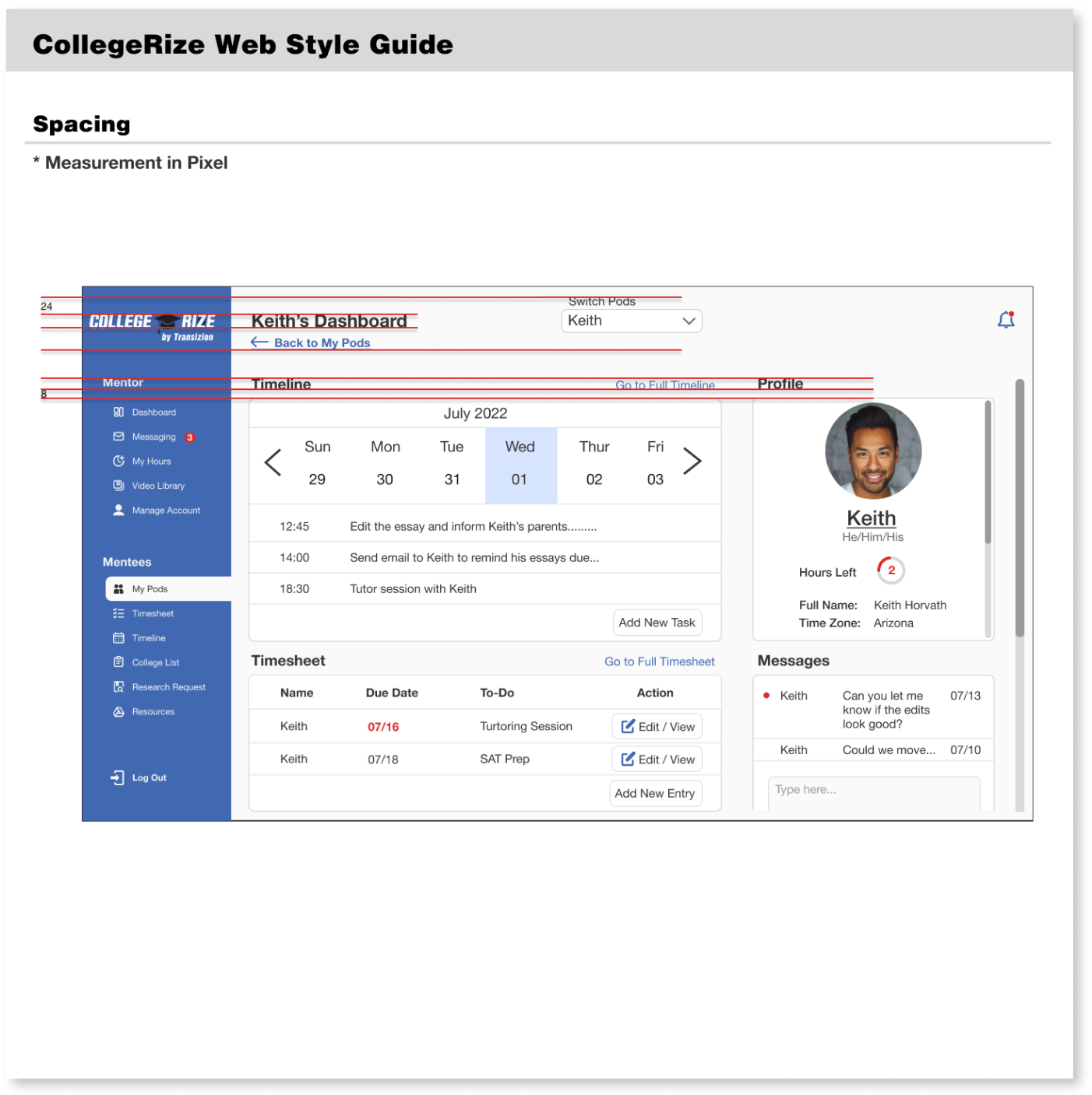
Usability testing and client feedback have revealed that the design needs an update to improve hierarchy, balance, contrast, and consistency. The finalized style guide prioritizes a consistent and tailored approach to typography, color, iconography, main menu navigation, and the grid system.
Key Design Principles
Improve usability
Collaborative design decisions made across teams
Use of typography, color, iconography, main menu navigation and the grid system
Customizable design system
Design System Implementation and Final Prototype
Using the style guide on the updated wireframes had proved to be beneficial in improving the usability even further. Final touches were made and the result was a success.
My Role and Responsibilities
As a Lead Product Designer, I led -
Building design processes
Designing wireframes
Prototyping
Developing and implementing style guide system
Designing client presentation
Lead Product Designer working with -
Project Manager & UX Writer
UX Researcher
Product Designer
Project Timeline
12 Weeks
In addition, I participated in -
Initial research
User Interviews
Data analysis and synthesis
User testing


